

About Manuel Amunategui
Data scientist with over 20-years experience in the tech industry, MAs in Predictive Analytics and
International Administration, co-author of Monetizing Machine Learning and VP of Data Science at SpringML.
From consulting in machine learning, healthcare modeling, 6 years on Wall Street in the financial industry, and 4 years at Microsoft, I feel like I’ve seen it all. And this has opened my eyes to the huge gap in educational material on applied data science. Like I say:
It just ain’t real 'til it reaches your customer’s plate
I am a startup advisor and available for speaking engagements with companies and schools on topics around building and motivating data science teams, and all things applied machine learning.
Reach me at amunategui@gmail.com


|

Exploring Some Pair-Trading Concepts with Python
Resources
Hi there, this is Manuel Amunategui- if you're enjoying the content, find more at ViralML.com
In this post, I want to share some simple ways of comparing stocks that are presumed related. My recommended approach for finding related companies is to use your own domain expertise. The second option is to use a site based on fundamental analysis that shows related companies (Google it, they’re lots out there like tipranks.com). I don’t recommend using pair-trading scanners as you’ll lose your shirt if you aren’t knowledgeable about the stock and sector - trader beware!
Once you have a few stocks in mind, you’re good to continue on with this exercise. Here we will use the ‘pair-trading’ classics of Coca-Cola vs. Pepsi, and FedEx vs. UPS.
Note: Everything discussed here is for educational purposes only.
import glob, os
import pandas as pd
import numpy as np
import matplotlib.pyplot as plt
import matplotlib.dates as mdates
Load market data for FDX, UPS, KO, PEP
There are plenty of sources to get free stock market data, Yahoo Finance is one of them. But all those who will want to do some serious research in this area should not rely on free data. You will eventually need a safe, reliable and currated source of stock data - no shortcuts here.
To access current data, you can manually download the files from Yahoo Finance. For example, if you wanted to get the latest historical prices for Apple, simply enter the following link:
https://finance.yahoo.com/quote/FDX/history?p=FDX
And then find and click the "Download Data" link, it will default to one year of end-of-day market data. Run through this process for all four stocks listed in the title and save the four CSV files in a directory named 'data'.
# find the data directory and extract each CSV file
path = "data/"
allFiles = glob.glob(os.path.join(path, "*.csv"))
np_array_list = []
for file_ in allFiles:
    df = pd.read_csv(file_,index_col=None, header=0)
    # get symbol name from file
    df['Symbol'] = (file_.split('/')[1]).split(".")[0]
    # pull only needed fields
    df = df[['Symbol','Date', 'Adj Close']]
    np_array_list.append(df.as_matrix())

# stack all arrays and tranfer it into a data frame
comb_np_array = np.vstack(np_array_list)
# simplify column names
stock_data_raw = pd.DataFrame(comb_np_array, columns = ['Symbol','Date', 'Close'])
# fix datetime data
stock_data_raw['Date'] = pd.to_datetime(stock_data_raw['Date'], infer_datetime_format=True)
stock_data_raw['Date'] = stock_data_raw['Date'].dt.date

# check for NAs
stock_data_raw = stock_data_raw.dropna(axis=1, how='any')

# quick hack to get the column names (i.e. whatever stocks you loaded)
stock_data_tmp = stock_data_raw.copy()

# make symbol column header
stock_data_raw = stock_data_raw.pivot('Date','Symbol')
stock_data_raw.columns = stock_data_raw.columns.droplevel()
# collect correct header names (actual stocks)
column_names = list(stock_data_raw)

stock_data_raw.tail()
# hack to remove mult-index stuff
stock_data_raw = stock_data_tmp[['Symbol', 'Date', 'Close']]
stock_data_raw = stock_data_raw.pivot('Date','Symbol')
stock_data_raw.columns = stock_data_raw.columns.droplevel(-1)
stock_data_raw.columns = column_names

# replace NaNs with previous value
stock_data_raw.fillna(method='bfill', inplace=True)

stock_data_raw.tail()
Make a copy of the data set before transforming it
stock_data = stock_data_raw.copy()
Plot paired stocks on different axes
plt.figure(figsize=(12,5))
ax1 = stock_data['FDX'].plot(color='green', grid=True, label='FDX')
ax2 = stock_data['UPS'].plot(color='purple', grid=True, secondary_y=True, label='UPS')
h1, l1 = ax1.get_legend_handles_labels()
h2, l2 = ax2.get_legend_handles_labels()

plt.legend(h1+h2, l1+l2, loc=2)
plt.show()

plt.figure(figsize=(12,5))
ax1 = stock_data['KO'].plot(color='green', grid=True, label='KO')
ax2 = stock_data['PEP'].plot(color='purple', grid=True, secondary_y=True, label='PEP')
h1, l1 = ax1.get_legend_handles_labels()
h2, l2 = ax2.get_legend_handles_labels()

plt.legend(h1+h2, l1+l2, loc=2)
plt.show()

Normalize data
In order to compare moves between differently priced assets, we need to normalize the data.
According to Wikipedia,
In statistics and applications of statistics, normalization can have a range of meanings. In the simplest cases, normalization of ratings means adjusting values measured on different scales to a notionally common scale, often prior to averaging.
https://en.wikipedia.org/wiki/Normalization_(statistics)
Percent Change And Cumsum
A very simple way to do this is to transform price data into percentage changes and apply a rolling sum, known as a cumulative sum.
def normalize_and_accumulate_series(data):
    # take tail to drop head NA
    return data.pct_change().cumsum()

stock_data['FDX'] = normalize_and_accumulate_series(stock_data['FDX'])
stock_data['UPS'] = normalize_and_accumulate_series(stock_data['UPS'])
stock_data['KO'] = normalize_and_accumulate_series(stock_data['KO'])
stock_data['PEP'] = normalize_and_accumulate_series(stock_data['PEP'])

# remove first row with NAs
stock_data = stock_data.tail(len(stock_data)-1)
stock_data.head()
Plot paired stocks on same axes
fig, ax = plt.subplots(figsize=(12,5))
plt.plot(stock_data['FDX'], color='green', label='FDX')
plt.plot(stock_data['UPS'], color='purple', label='UPS')
ax.grid(True)
plt.legend(loc=2)
plt.show()

fig, ax = plt.subplots(figsize=(12,5))
plt.plot(stock_data['KO'], color='purple', label='KO')
plt.plot(stock_data['PEP'], color='green', label='PEP')
ax.grid(True)
plt.legend(loc=2)
plt.show()

Getting some statistical measurements
# pip install scipy
# pip install statsmodels
from statsmodels.tsa.stattools import coint

def corr(data1, data2):
    "data1 & data2 should be numpy arrays."
    mean1 = data1.mean()
    mean2 = data2.mean()
    std1 = data1.std()
    std2 = data2.std()
    corr = ((data1*data2).mean()-mean1*mean2)/(std1*std2)
    return corr
stock_name_1 = 'KO'
stock_name_2 = 'PEP'

score, pvalue, _ = coint(stock_data[stock_name_1], stock_data[stock_name_2])
correlation = corr(stock_data[stock_name_1], stock_data[stock_name_2])

print('Correlation between %s and %s is %f' % (stock_name_1, stock_name_2, correlation))
print('Cointegration between %s and %s is %f' % (stock_name_1, stock_name_2, pvalue))
stock_name_1 = 'UPS'
stock_name_2 = 'FDX'

score, pvalue, _ = coint(stock_data[stock_name_1], stock_data[stock_name_2])
correlation = corr(stock_data[stock_name_1], stock_data[stock_name_2])

print('Correlation between %s and %s is %f' % (stock_name_1, stock_name_2, correlation))
print('Cointegration between %s and %s is %f' % (stock_name_1, stock_name_2, pvalue))
Measuring separatation and spikes highlights
This is straighforward, we simply subtract the two related and normalized series
fig, ax = plt.subplots(figsize=(12,5))
plt.plot(stock_data['FDX'] - stock_data['UPS'], color='purple', label='Diff FDX minus UPS')
ax.grid(True)
ax.axhline(y=0, color='black', linestyle='-')
plt.legend(loc=2)
plt.show()

fig, ax = plt.subplots(figsize=(12,5))
plt.plot(stock_data['KO'] - stock_data['PEP'], color='purple', label='Diff KO minus PEP')
ax.grid(True)
ax.axhline(y=0, color='black', linestyle='-')
plt.legend(loc=2)
plt.show()

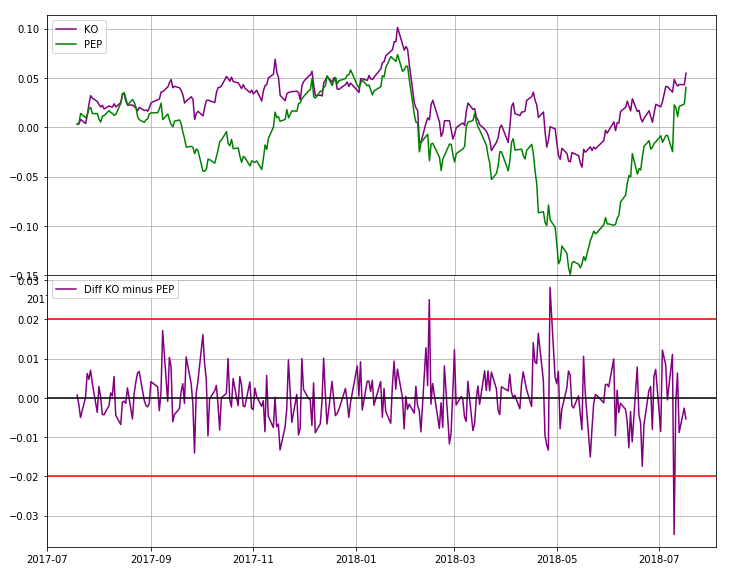
Designing spike thresholds
# get the original data set
stock_data = stock_data_raw.copy()
def normalize_series(data):
    # take tail to drop head NA
    return data.pct_change()

stock_data['FDX'] = normalize_series(stock_data['FDX'])
stock_data['UPS'] = normalize_series(stock_data['UPS'])
stock_data['KO'] = normalize_series(stock_data['KO'])
stock_data['PEP'] = normalize_series(stock_data['PEP'])

# remove first row with NAs
stock_data = stock_data.tail(len(stock_data)-1)
stock_data.head()
fig, ax = plt.subplots(figsize=(12,5))
plt.plot(stock_data['FDX'] - stock_data['UPS'], color='purple', label='Diff FDX minus UPS')
ax.grid(True)
ax.axhline(y=0, color='black', linestyle='-')
ax.axhline(y=0.02, color='red', linestyle='-')
ax.axhline(y=-0.02, color='red', linestyle='-')
plt.legend(loc=2)
plt.show()

fig, ax = plt.subplots(figsize=(12,5))
plt.plot(stock_data['KO'] - stock_data['PEP'], color='purple', label='Diff KO minus PEP')
ax.grid(True)
ax.axhline(y=0, color='black', linestyle='-')
ax.axhline(y=0.02, color='red', linestyle='-')
ax.axhline(y=-0.02, color='red', linestyle='-')
plt.legend(loc=2)
plt.show()

Manuel Amunategui - Follow me on Twitter: @amunategui